CSA Kikit Campaign
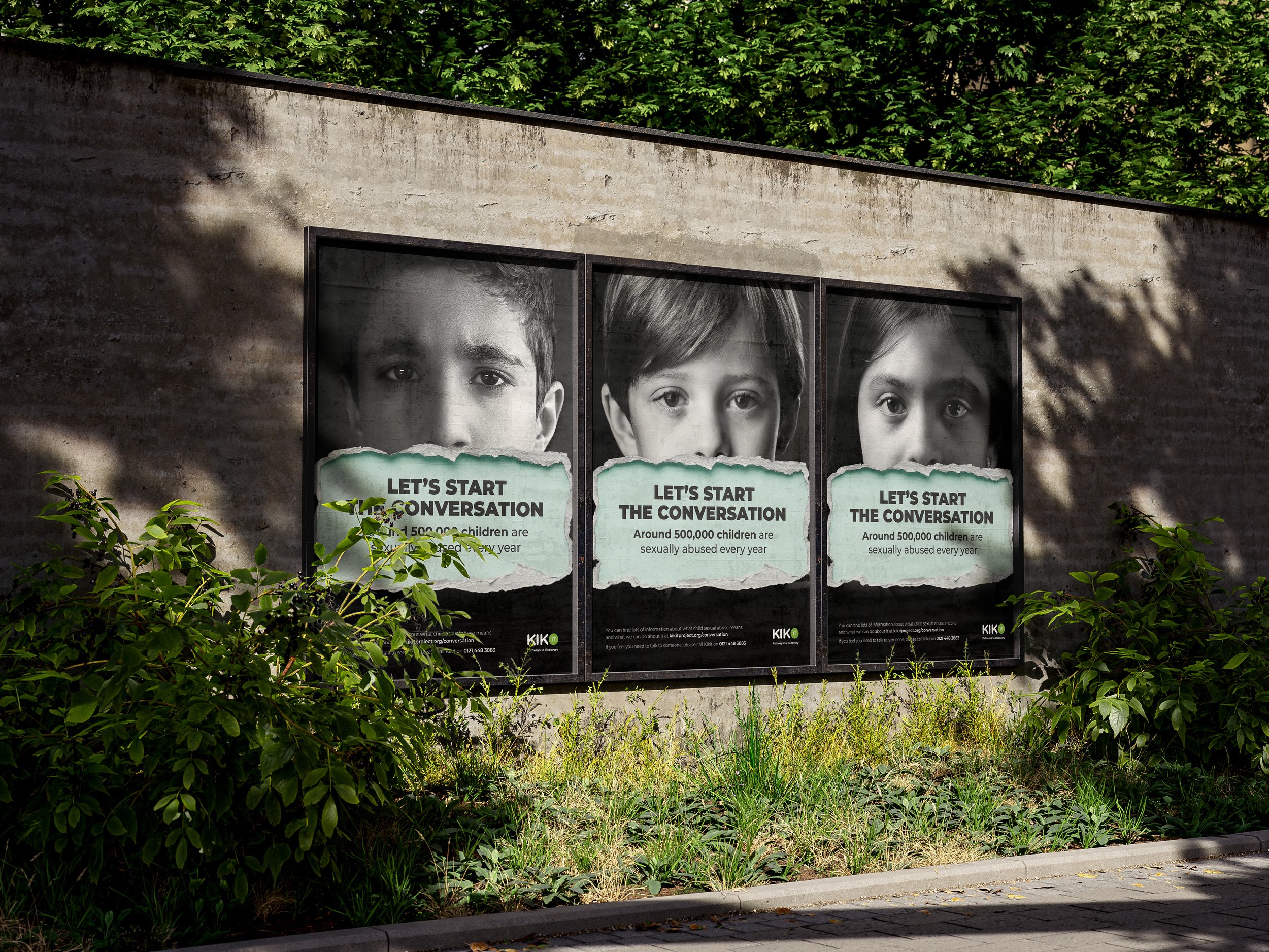
KIKIT is a charity founded to support the health and social care needs of people from hard to reach and marginalised communities. Child sexual abuse statistics have increased, it affects every community and it can happen anywhere. By understanding more about child sexual abuse and talking about it openly in our communities, we can make sure our children are protected. They wanted to create a OOH and digital campaign to highlight child sexual abuse.
The Challenge
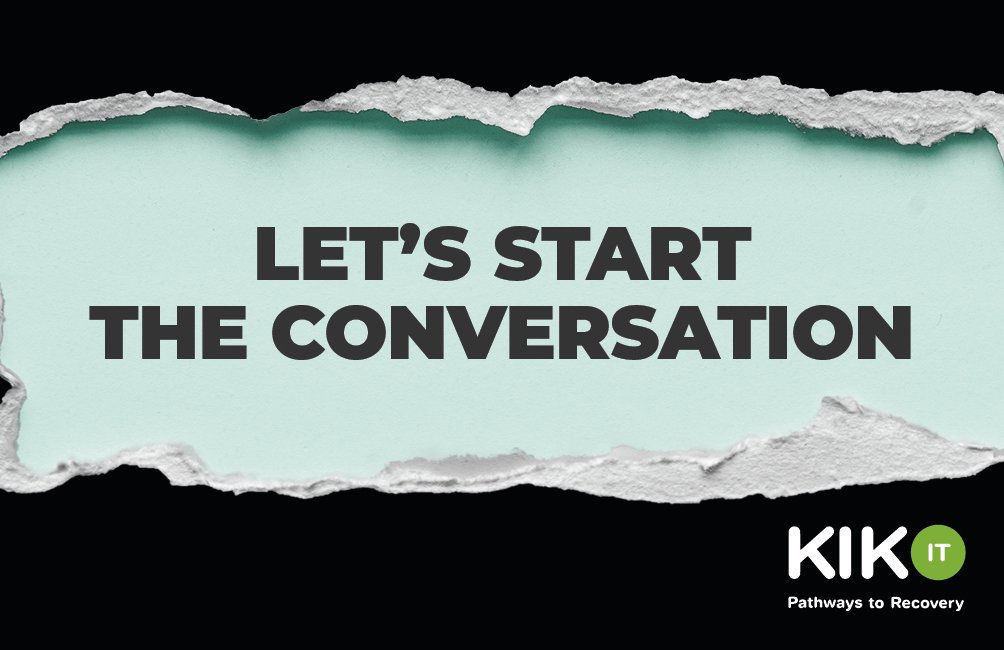
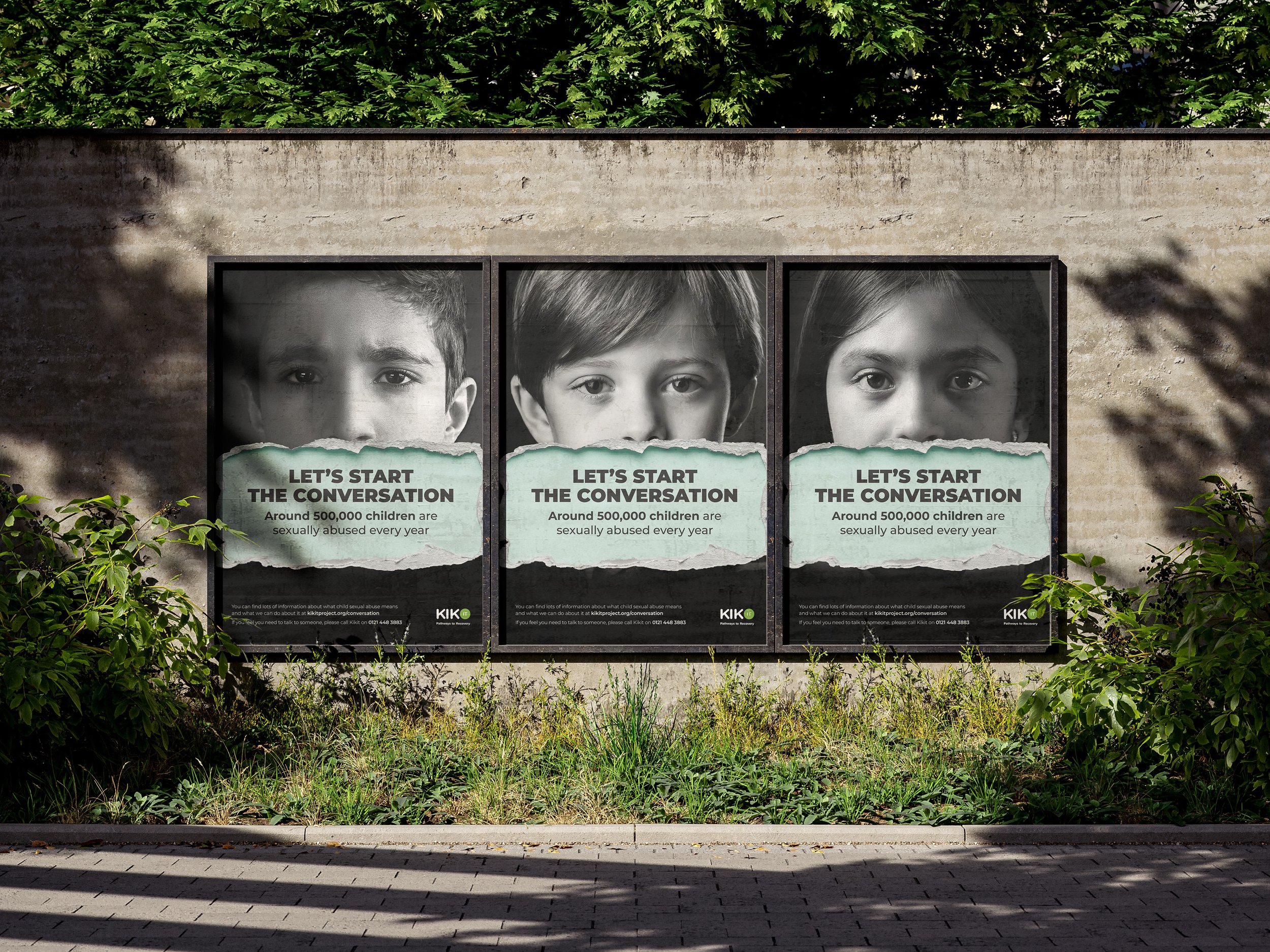
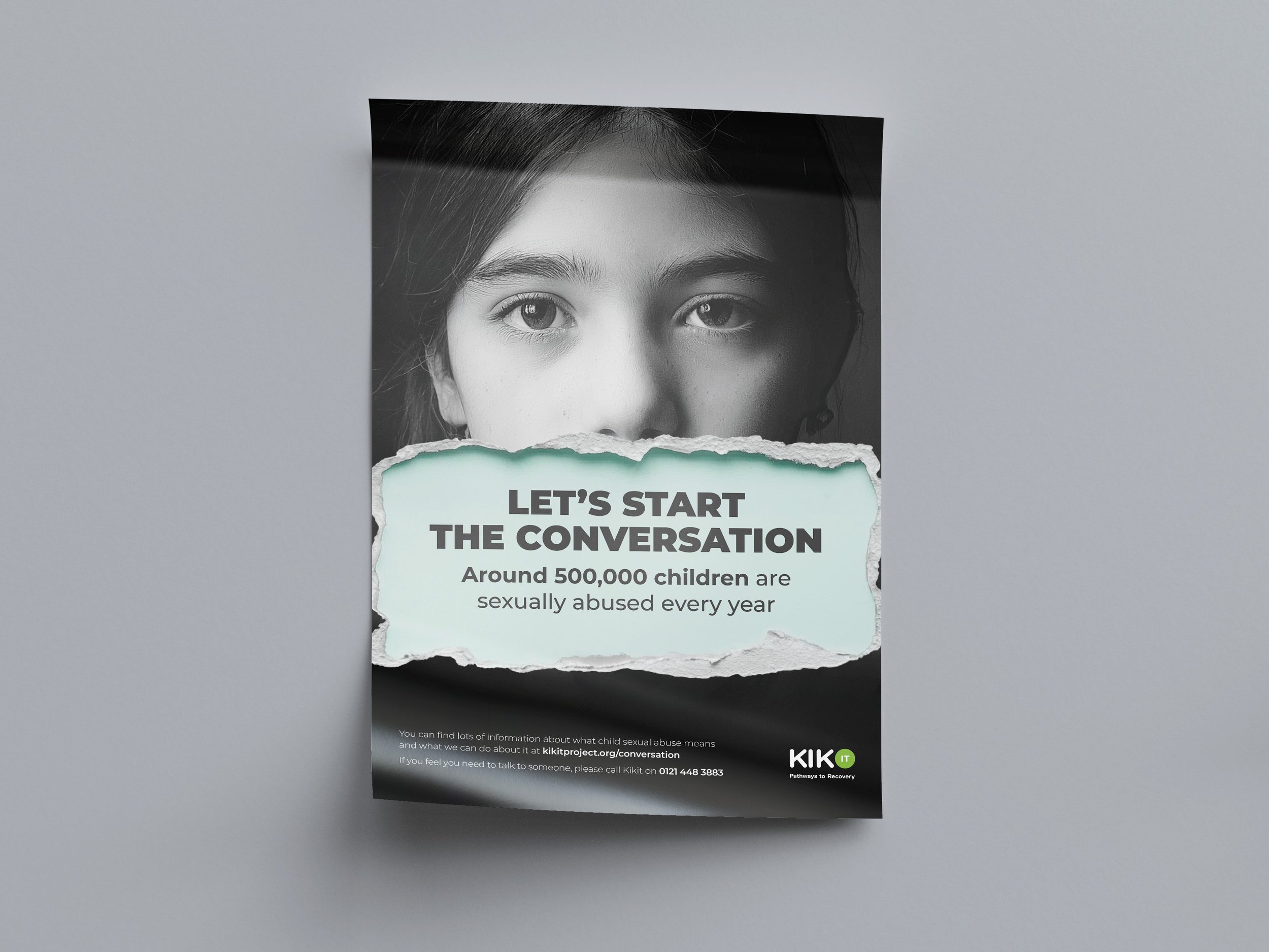
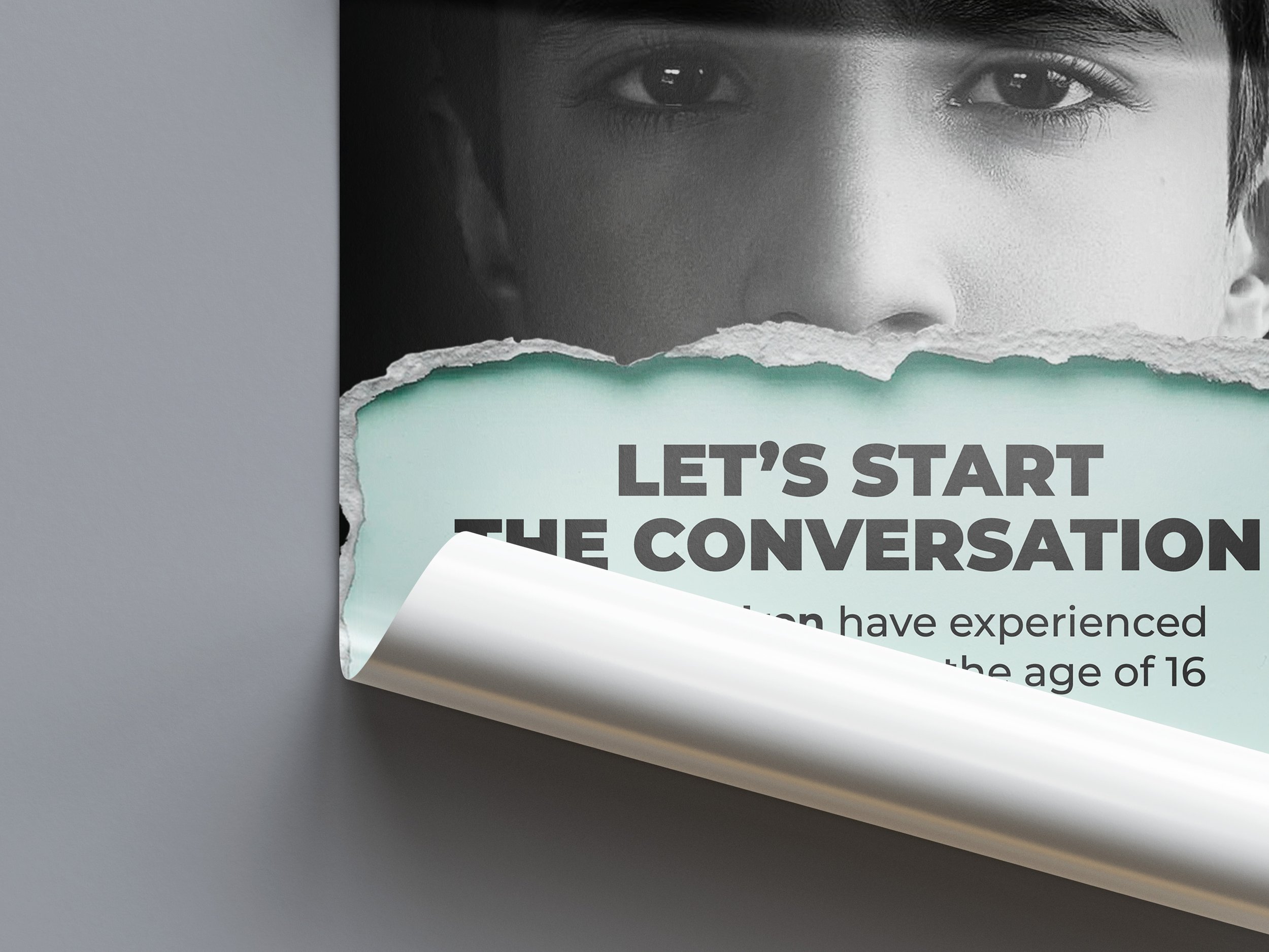
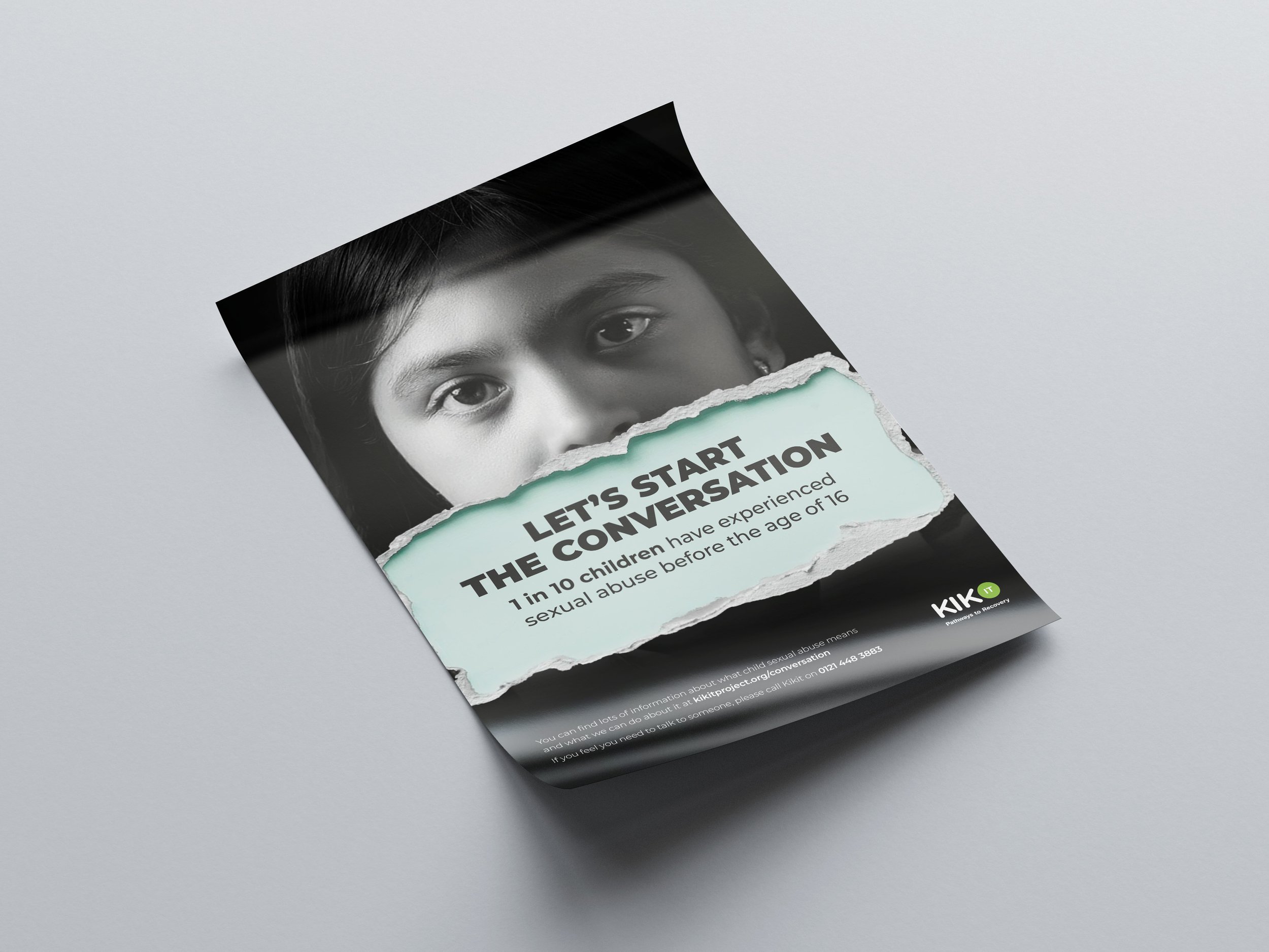
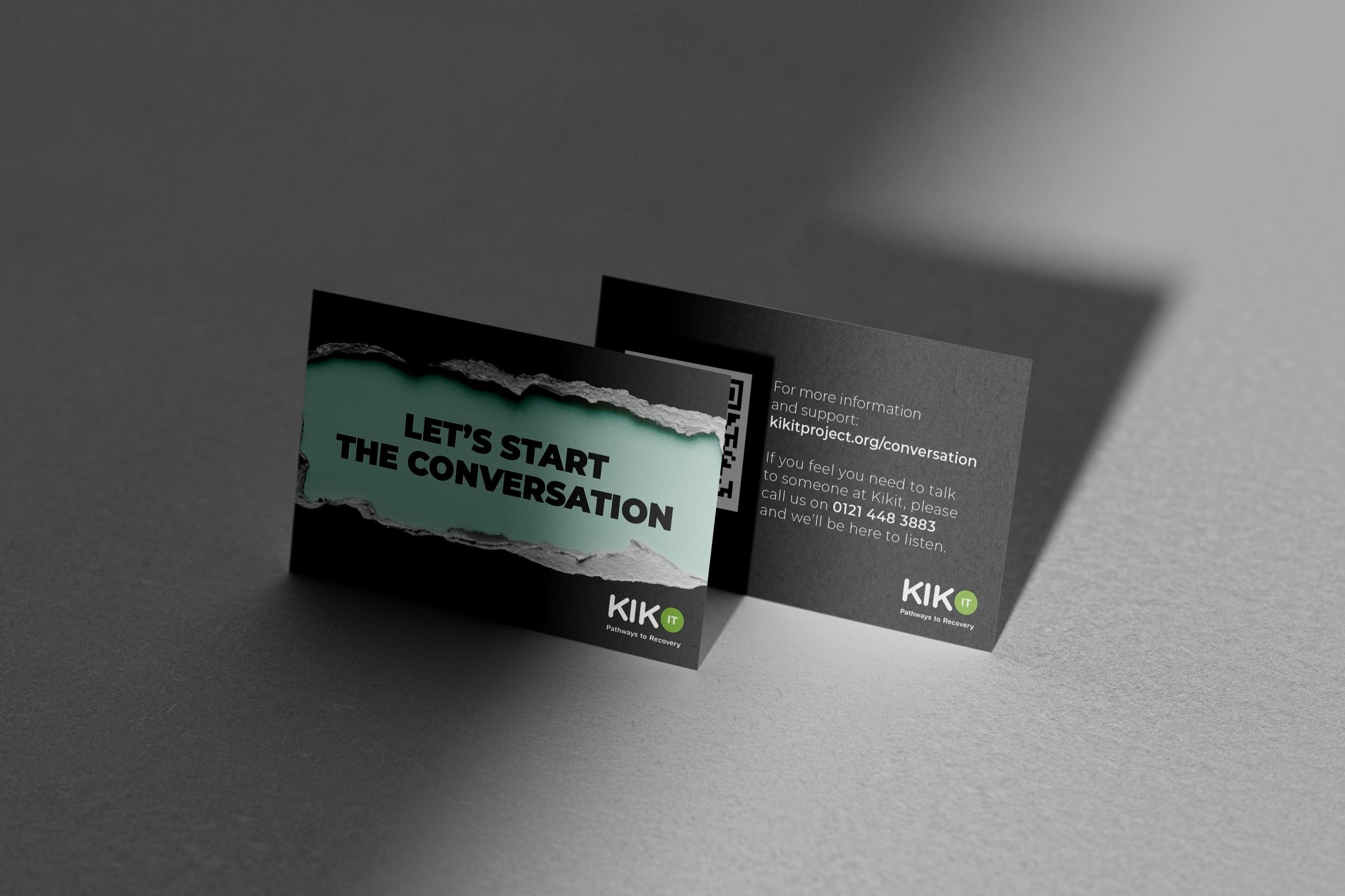
The campaign required balancing a sensitive subject with striking graphics in a delicate process that required thoughtful consideration of the audience, the message, and the emotions the visuals may evoke. Using visual techniques such as the torn edges to distress the image and contextualise the issue.
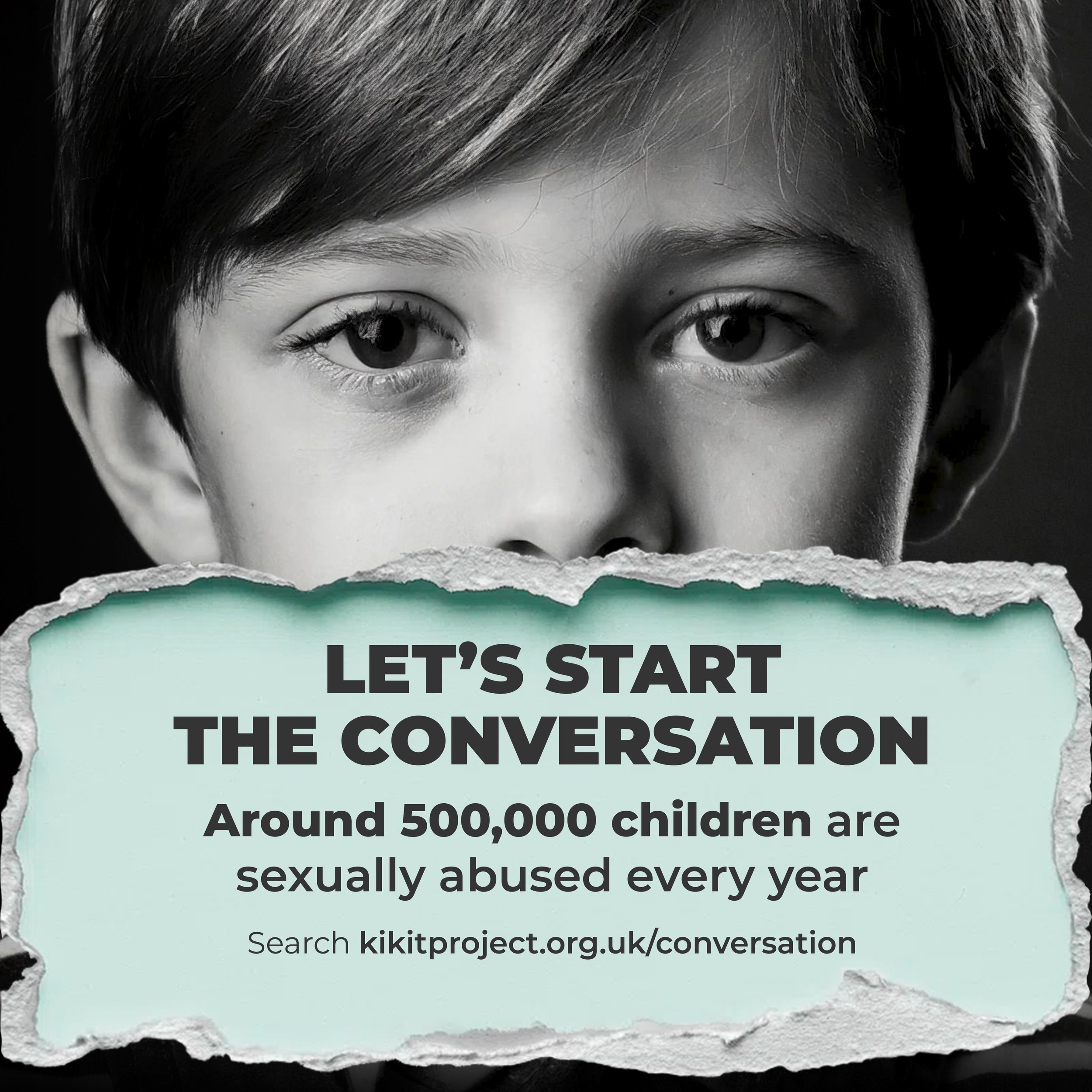
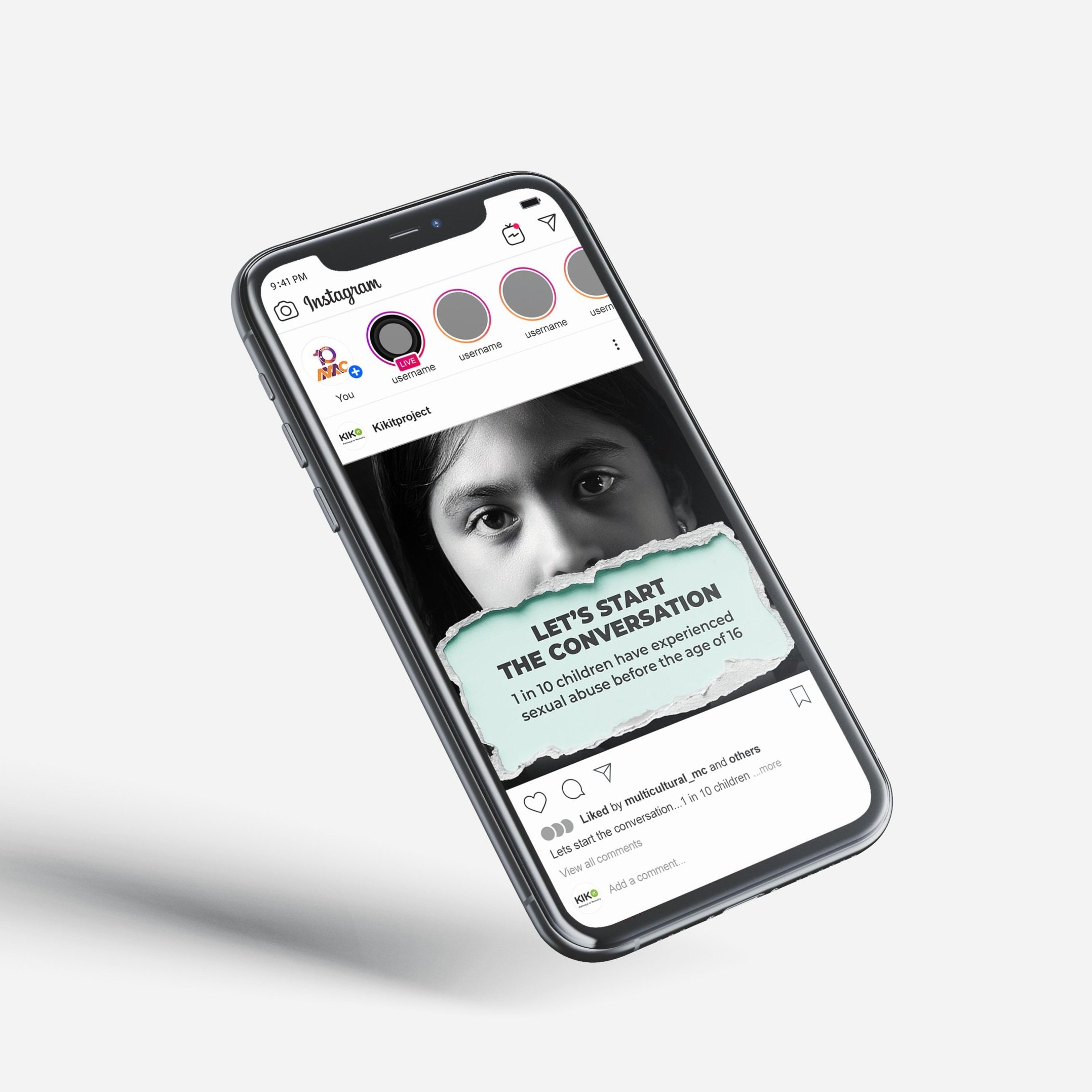
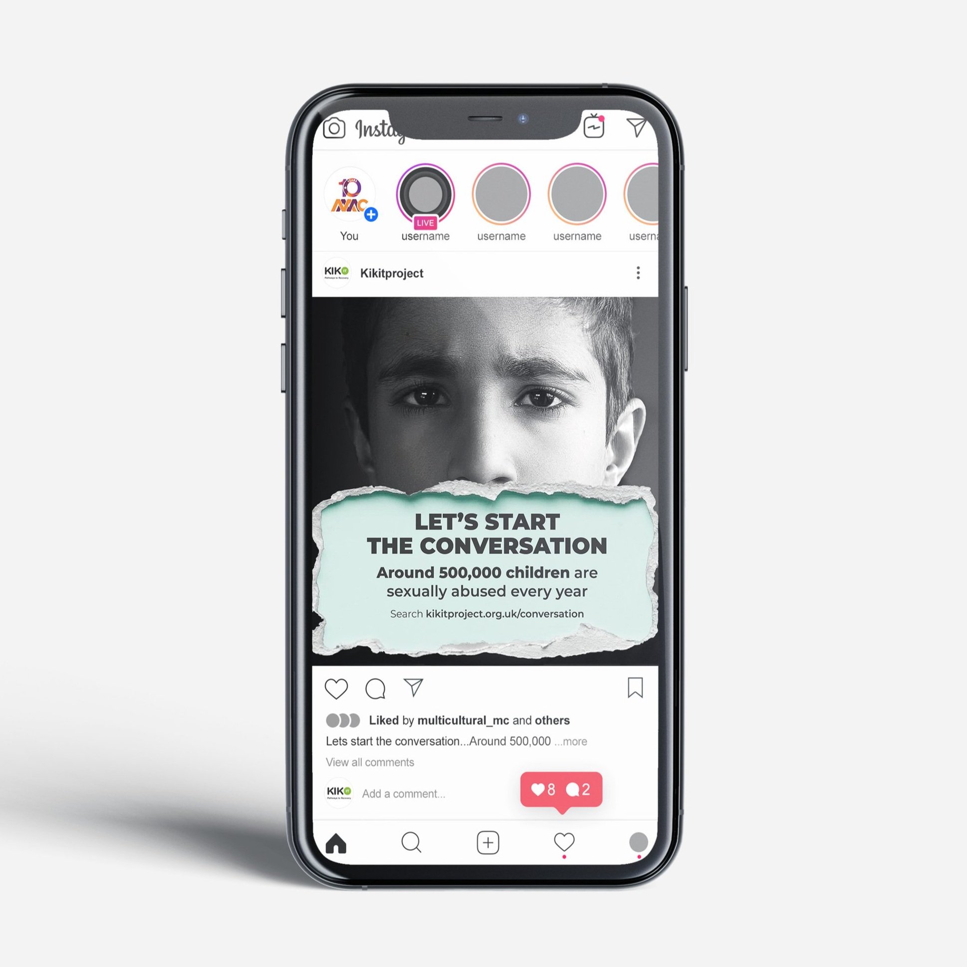
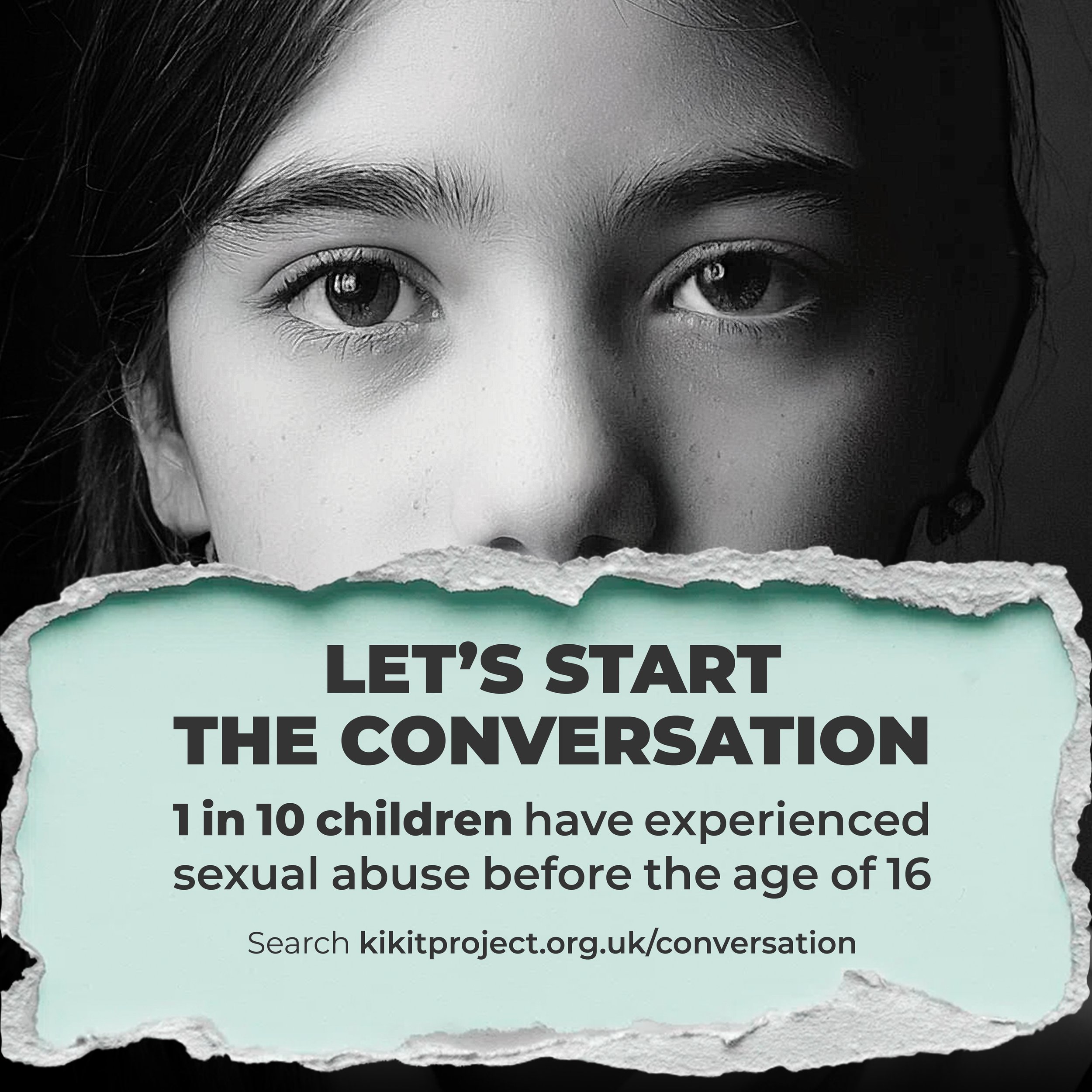
The headline typography, Montserrat Black, is indicative of the Kikit brand. By removing the distraction of colour in the photography, it draws attention to the vulnerability and somber tone of the campaign. The jagged, uneven lines of ripped paper represents seperation. It symbolises a split or division, whether it's a conflict between ideas, people, or internal struggles within. It visually communicates separation or a rift, whether physical, emotional, or intellectual.
Special thanks
*This campaign was nominated for multiple categories at The PR awards, and Drum awards.
Client
Kikit Managing Director Mohammed Ashfaq
MMC Director Patricia Macauley
MMC Cultural Communications Manger Tejal Pota
MMC Strategic Campaign Lead Lara Cooper
Creative
Designer Sam Marshall


