
Rendition
Discover the world of poetry all around you whilst on the go by scanning or photographing poems. ‘Rendition’ is an app supported by the Arts Council for England to encourage people to uncover poetry, the poets, summaries and insights.
As the design lead I was tasked with taking the app’s UI wireframes and creating the visual world of ‘Rendition’ which entailed delivering a logo, interface design, brand style and guidelines and illustrations.
Poetry brought
to life.
The Challenge
To create a brand and UI design that was confident, expressive and playful. Using a bold approach to typography and storytelling and illustration to encourage users to unlock the world of poetry.
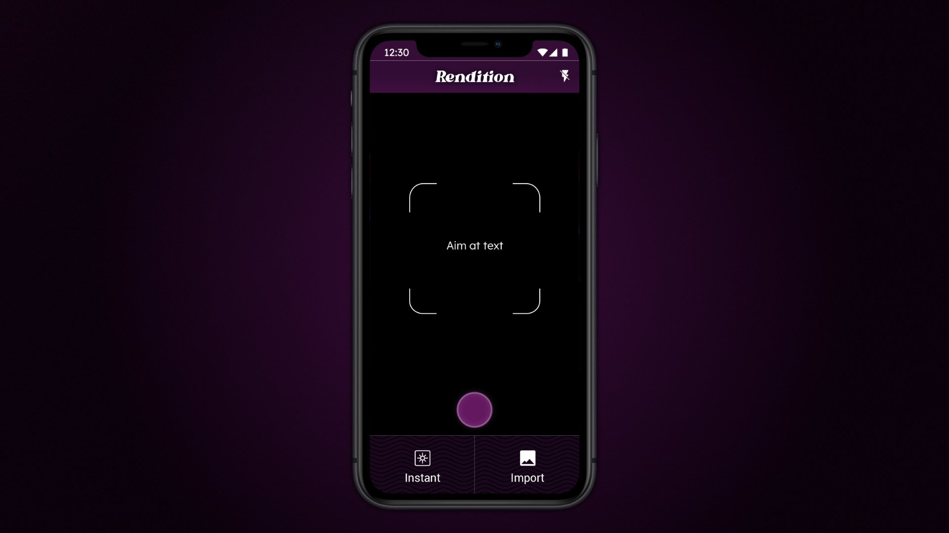
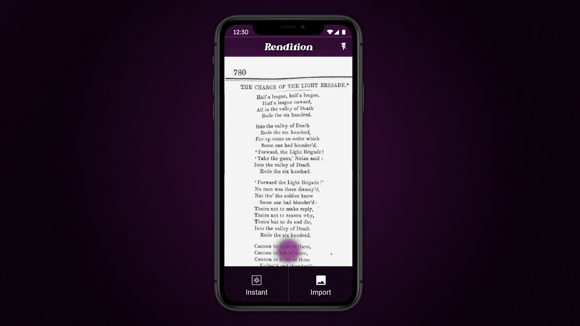
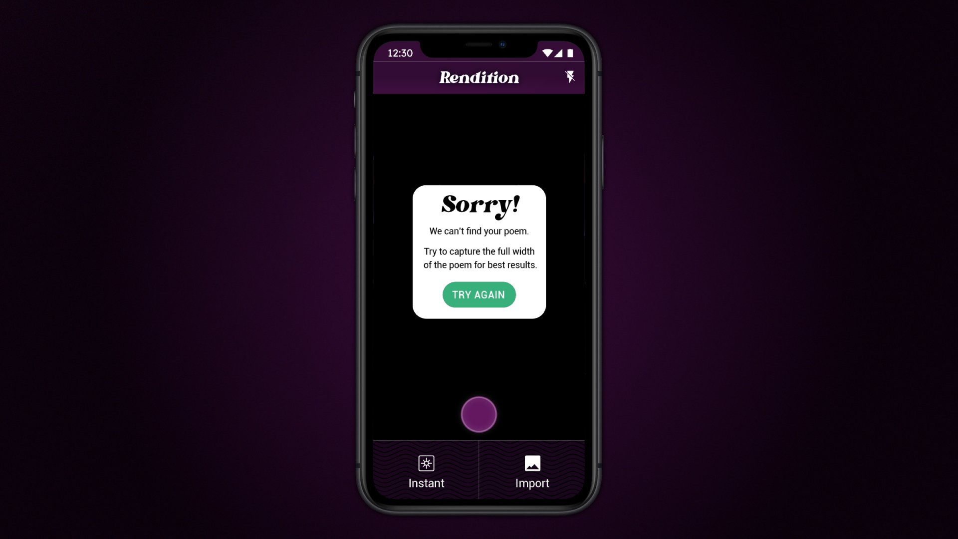
When designing the user interface (UI) for the app, it was important to balance the aesthetic with usability. It was important to maintain a consistent color scheme, typography hierarchy, and icon style throughout the app to make navigation and comprehension easier.
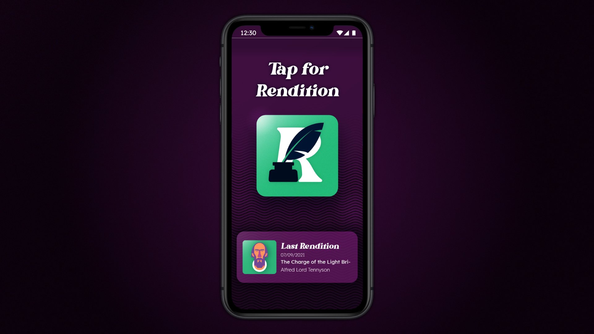
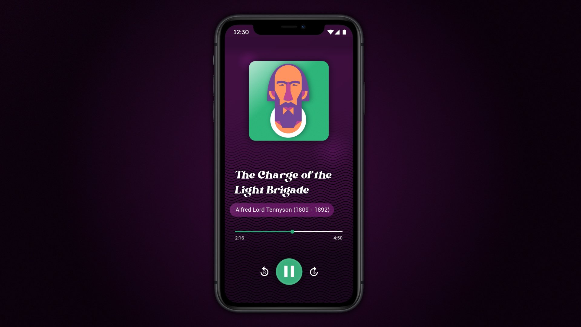
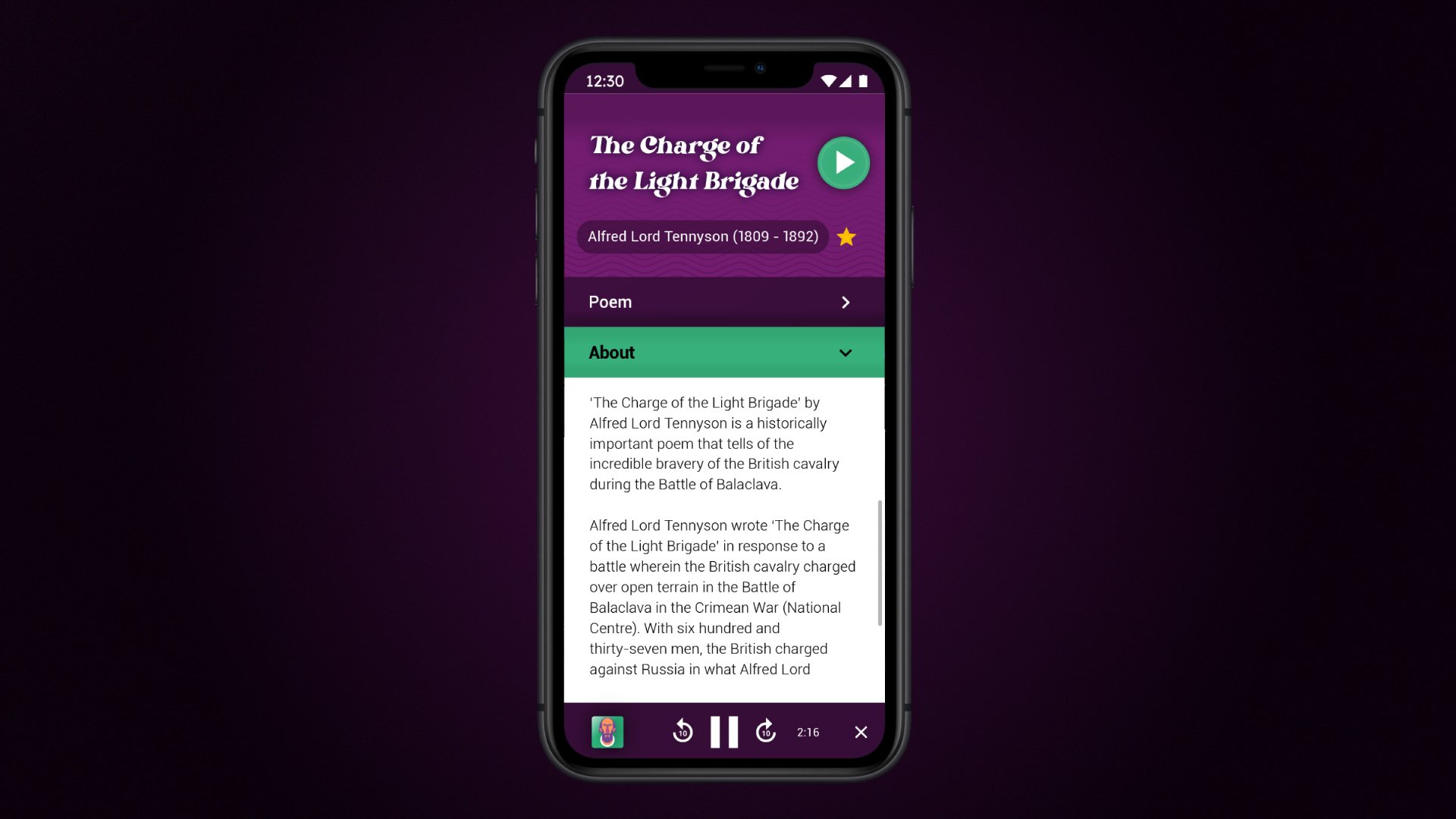
The logo uses the typeface 'Bright Italic' for its ligatures and curveature giving it both a modern and retro look, it also reflect the apps archive of poets from the past and present. The ink and feather quill placed through the negative space of the 'R' are almost archetypal symbols of poetry and literature. To create the instant association of Rendition with poetry.
The design uses a colour palette of dark rich ink colours with a few bright colours to contrast. The beautiful tails and curves of 'Bright italic' work well for headlines. With 'Roboto Light' used for body copy for its optimised readability across a wide variety of devices and reading environments.


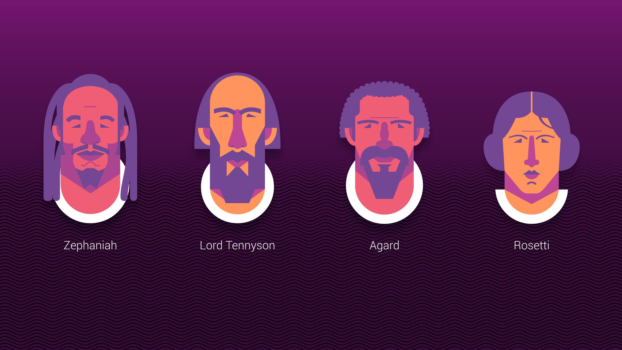
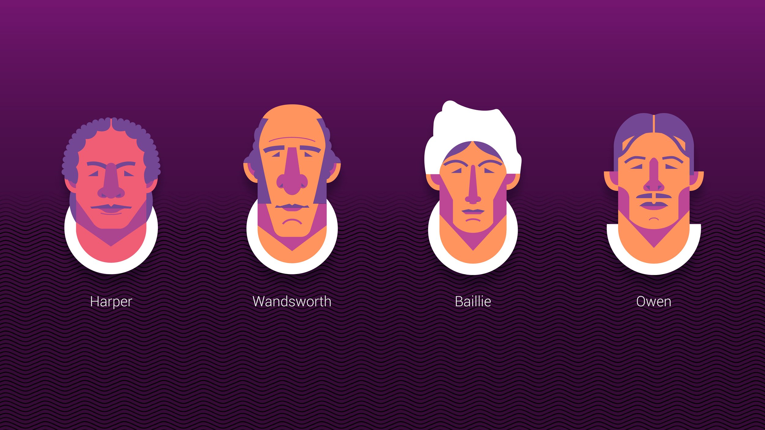
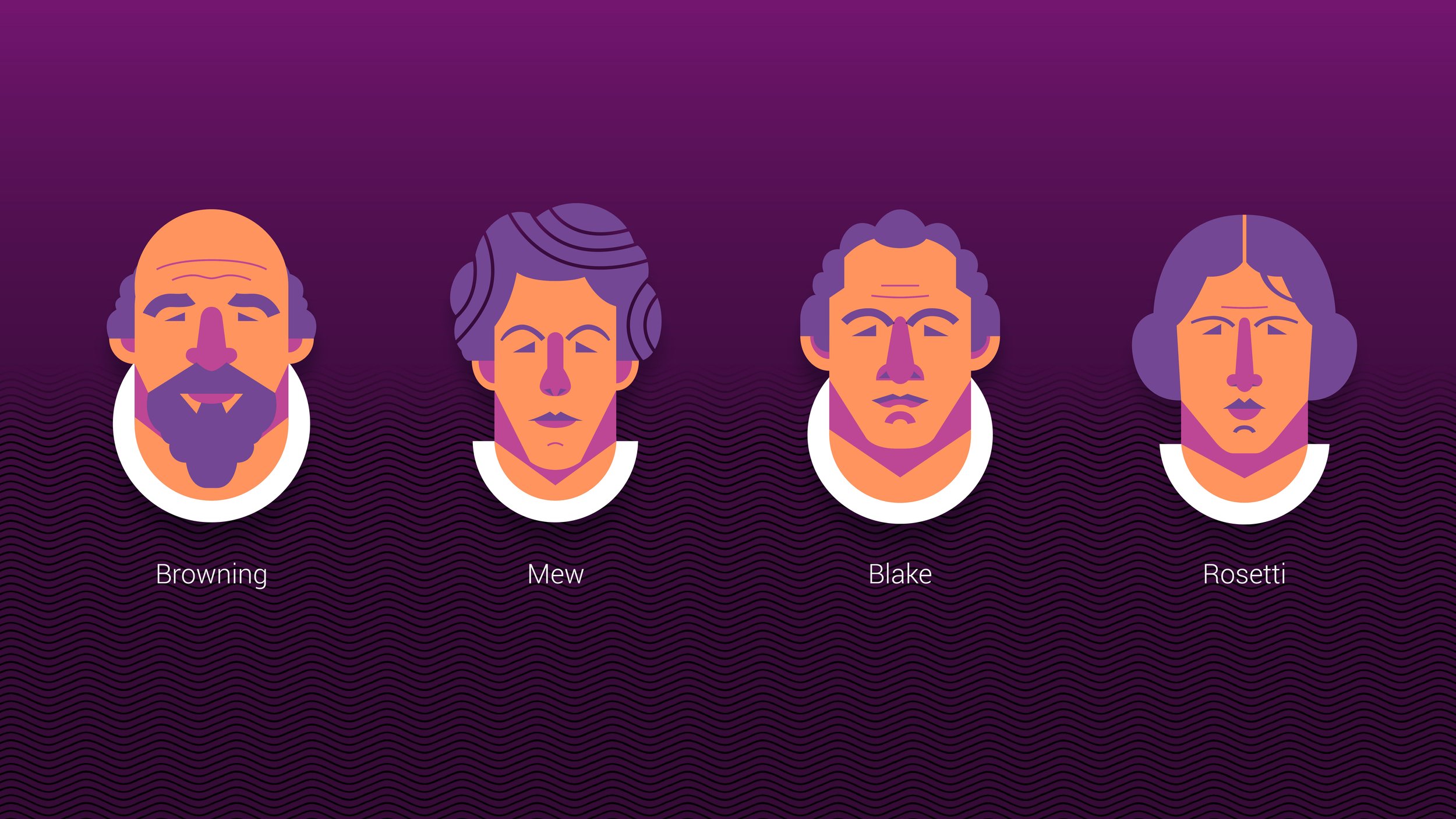
To compliment the Poet bio’s I created illustrated portraits. The composition is inspired by busts depicting just the poet’s head and neck. The symmetrical geometric style was used to simplify the process of creating a large archive of illustrated poets.

Special thanks
Client Arts Council For England
Agency East City Film
Director Ashley Cowan
Designer/ Illustrator Sam Marshall


